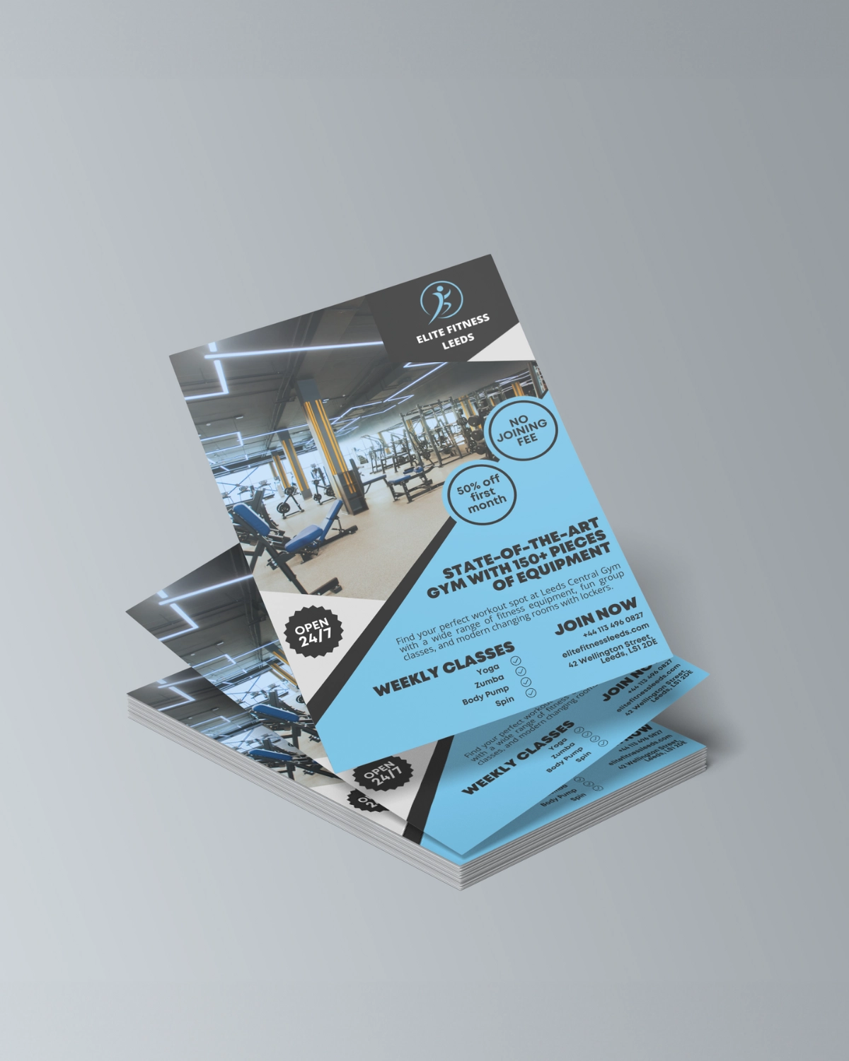
Want more gym-goers? Then listen up. Creating a gym flyer that converts is not just about flashy images or complex designs – it’s about making a memorable and actionable impression. Your gym flyer is often the first point of contact with potential customers, so it needs to hit the mark. Here, we combine proven design tips with strategic content hacks to help you craft flyers that get results.
Section 1: Design Hacks to Grab Attention
Your flyer's design is crucial in making that all-important first impression. Here's how to ensure your flyer stands out:
Use Bright Colours:
Play with Contrast:
Clear, Bold Headlines:
Compelling Imagery:
Readability is Key:
Strong Call to Action:
Remember, your flyer is a visual ambassador for your gym – make it as eye-catching and intriguing as possible.
Section 2: Content Hacks for Conversion
But it's not all about the design. The content of your flyer is equally critical. Here are three content-focused hacks to make your gym flyers more effective:
Offer Exclusivity:
Real Testimonials:
Simplicity and Directness:
The ultimate goal is to drive action – whether it's a phone call, a sign-up on your website, or a visit to your gym.
Conclusion:
Next time you’re designing a gym flyer, remember these design and content hacks. By making your flyer both visually striking and content-rich, you’ll set the stage for increased interest and higher conversions. Go get ‘em and watch your gym community grow!


